Mobile usability — before and after
Branch mobile-usability. Every number below was taken in real
Chrome by asking the page, at each step's own centre, which element is physically on
top of it (elementFromPoint) — not by reading the markup.
Reachability
“Reachable” means a tap at the step's centre lands inside that step rather than on the glass covering it.
| Viewport | Page | Steps you can tap | Title width | ||
|---|---|---|---|---|---|
| before | after | before | after | ||
| 390x844 | workflow | 0 / 6 | 6 / 6 | 0px | 186px |
| 390x844 | review gate | 1 / 2 | 2 / 2 | 0px | 125px |
| 768x1024 | workflow | 2 / 6 | 6 / 6 | 183px | 183px |
| 768x1024 | review gate | 1 / 2 | 2 / 2 | 134px | 134px |
| 1280x900 | workflow | 4 / 6 | 4 / 6 | 183px | 183px |
| 1280x900 | review gate | 2 / 2 | 2 / 2 | 134px | 134px |
What was wrong
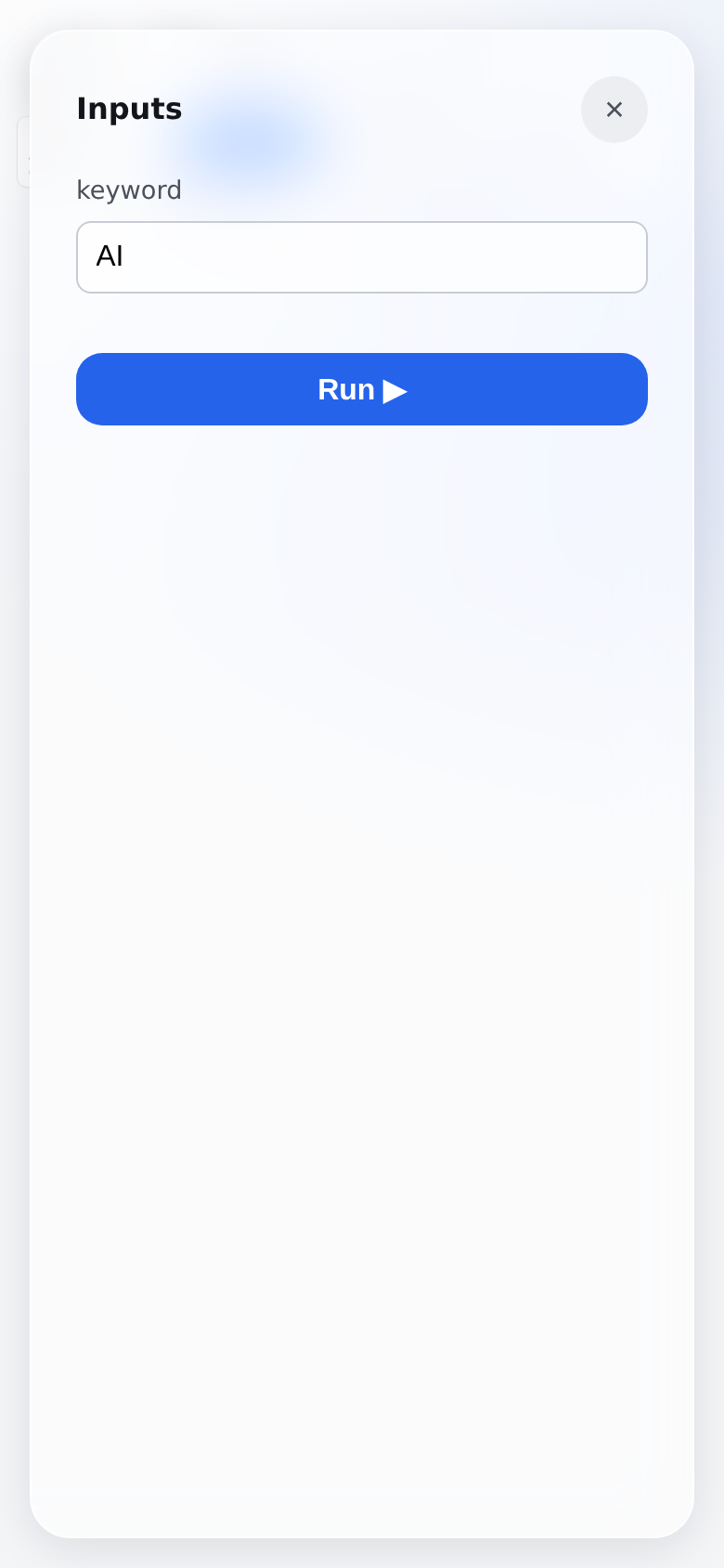
- The phone opened onto a full-screen panel, not the app. A workflow page auto-opens its first step's drawer, and the phone drawer was full height — so all six steps were underneath it. Not hard to reach: absent.
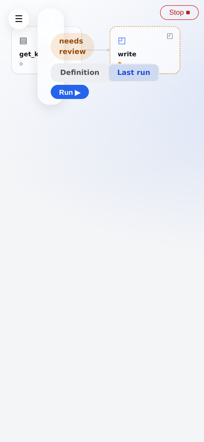
- The title rendered at 0px. The header's drawer-avoidance width went
negative below 772px and was never overridden; in one flex row the
<h1>was the only item that could shrink, so it absorbed the whole shortfall. - Tapping a step did nothing. Pan and tap were told apart by a 4px threshold — a mouse number. A fingertip rolls 6–10px on an ordinary tap, so the tap was read as a drag and the drag swallowed the click.
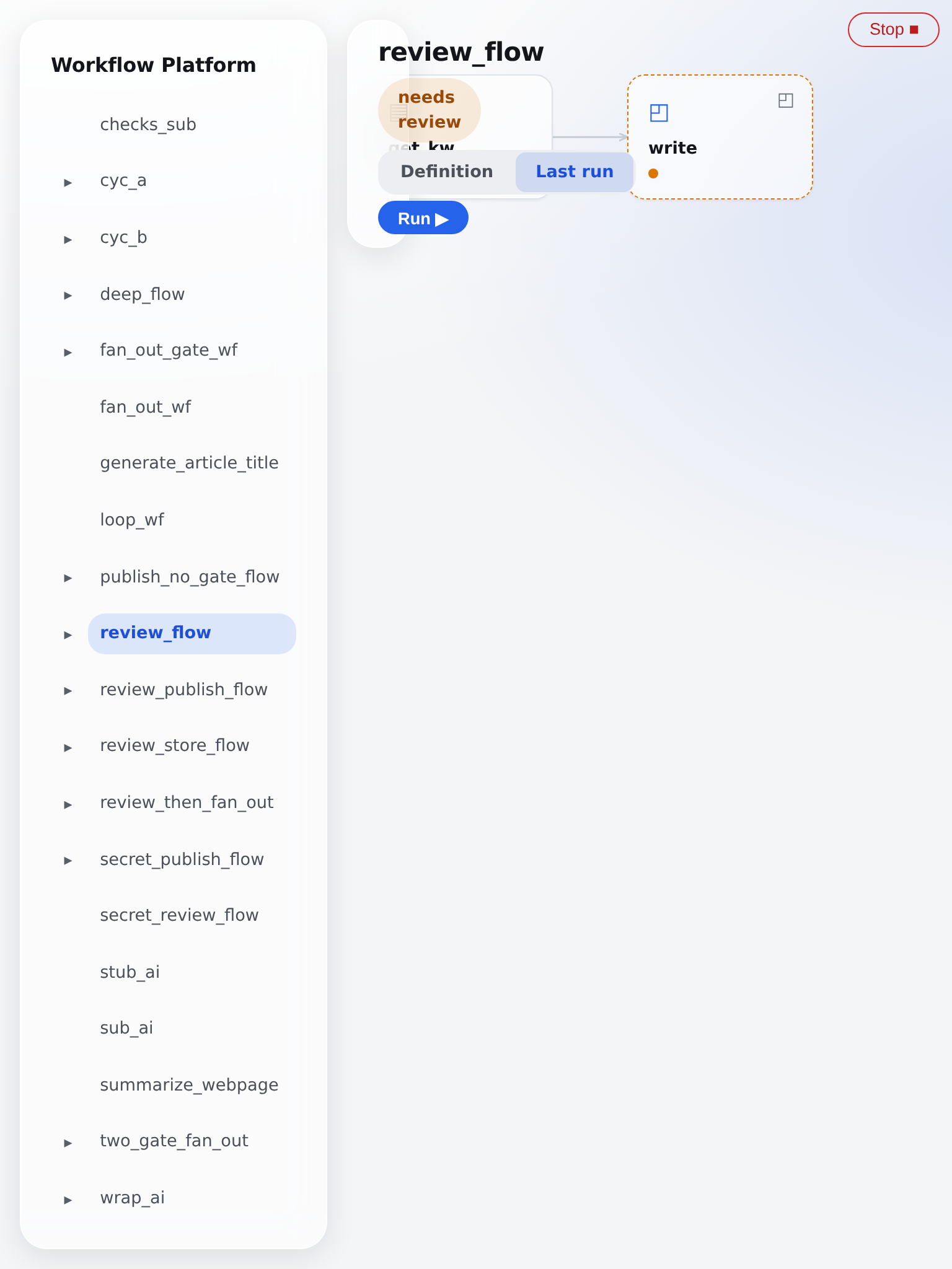
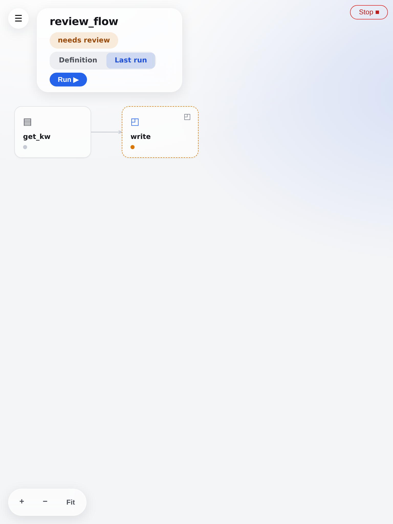
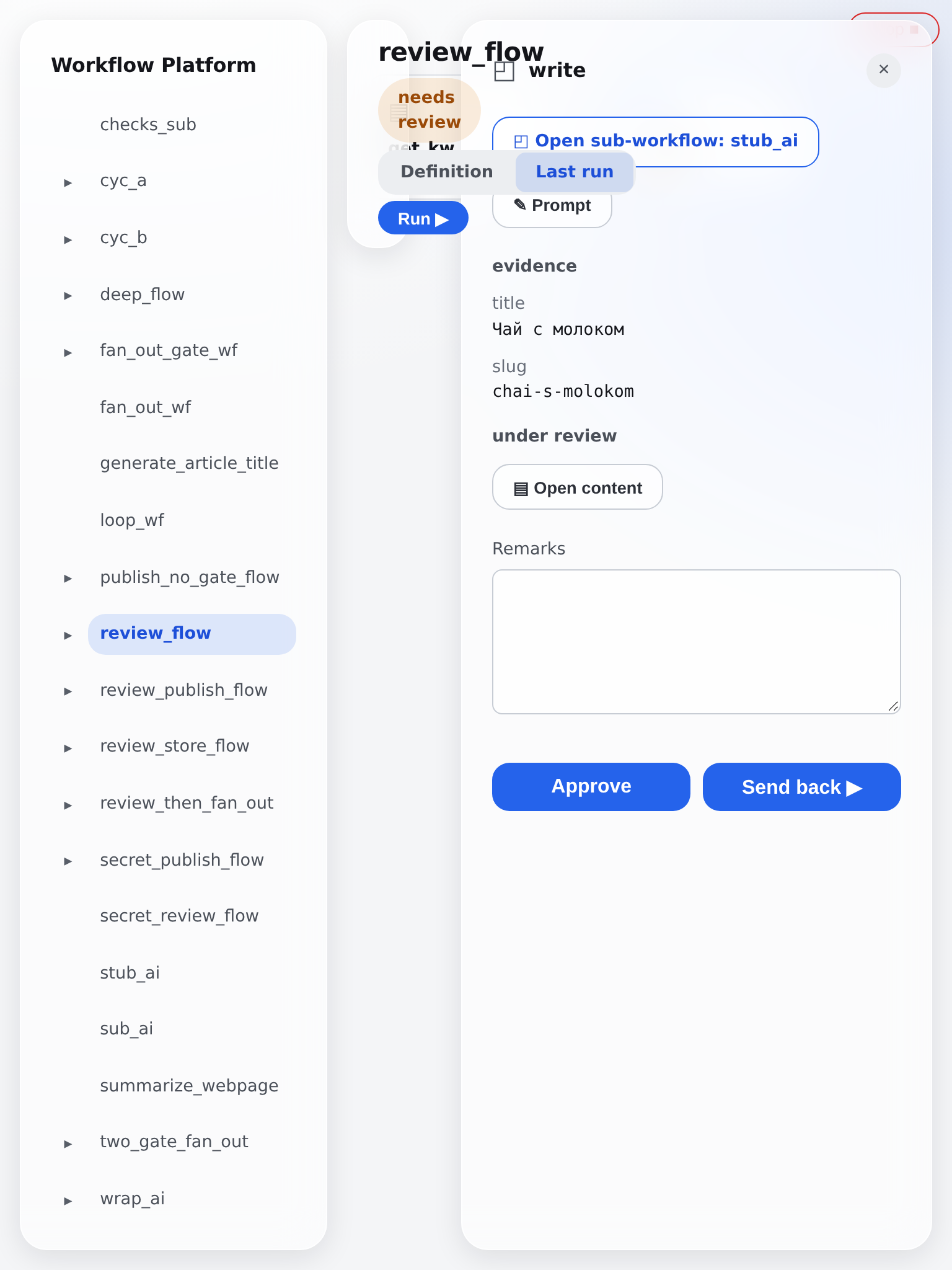
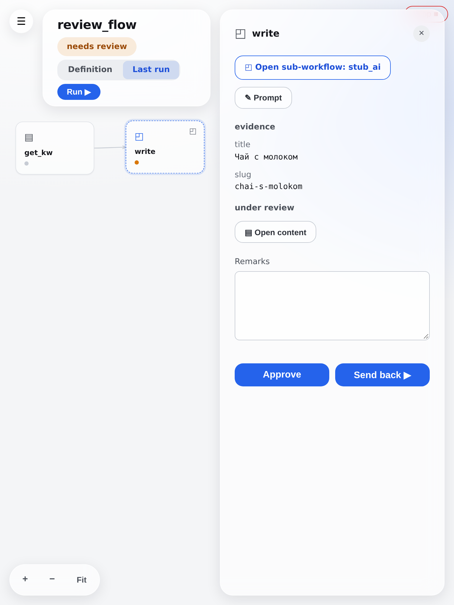
- 721–1024px fell between two layouts and got the worst of both: a fixed 248px sidebar plus a 380px drawer on a 768px screen, no menu button, and no scrollbar to say anything was missing.
- Five small-screen CSS rules had never applied at all. A media query adds no specificity, so they were losing on source order to the component rules below them.
The gesture question
Trackpad panning and touch panning have never shared a
code path — so the two-finger trackpad panning you asked for was not what
broke the phone. A trackpad swipe arrives as a wheel event; a touchscreen
never fires wheel. Touch goes through Pointer Events: one finger pans, two
pinch.
What they did share was the single constant deciding whether a gesture was a drag or a tap, and it was tuned for a mouse. That is now per pointer type. Both trackpad gestures are covered by tests that pass before and after, so the behaviour you asked for is pinned down.
Screens
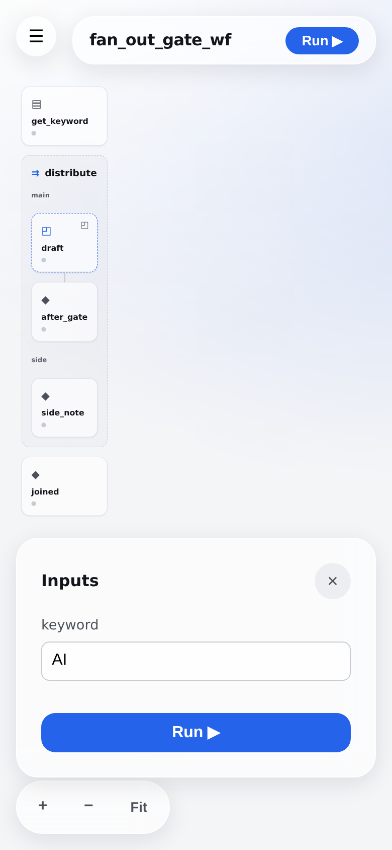
iPhone 390×844 — Opening a workflow
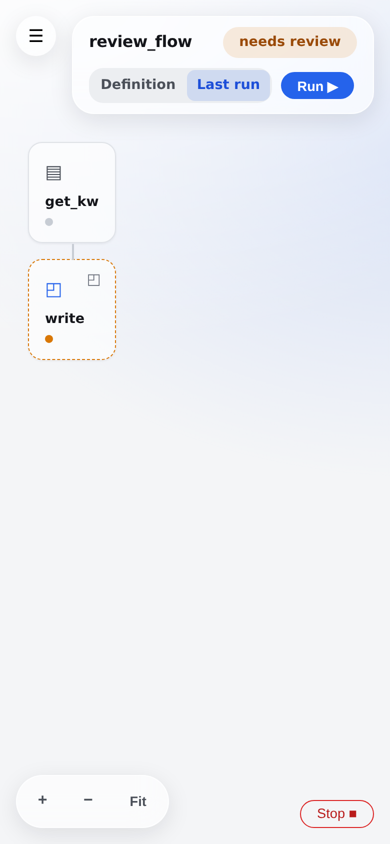
iPhone 390×844 — The page with a run parked at a review gate
iPhone 390×844 — The review gate open — approve or send back
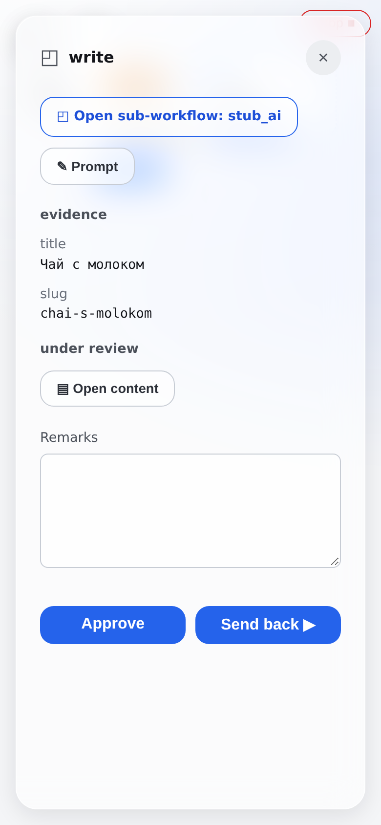
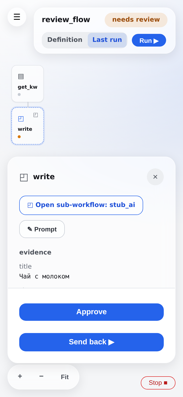
Tablet 768×1024 — Opening a workflow
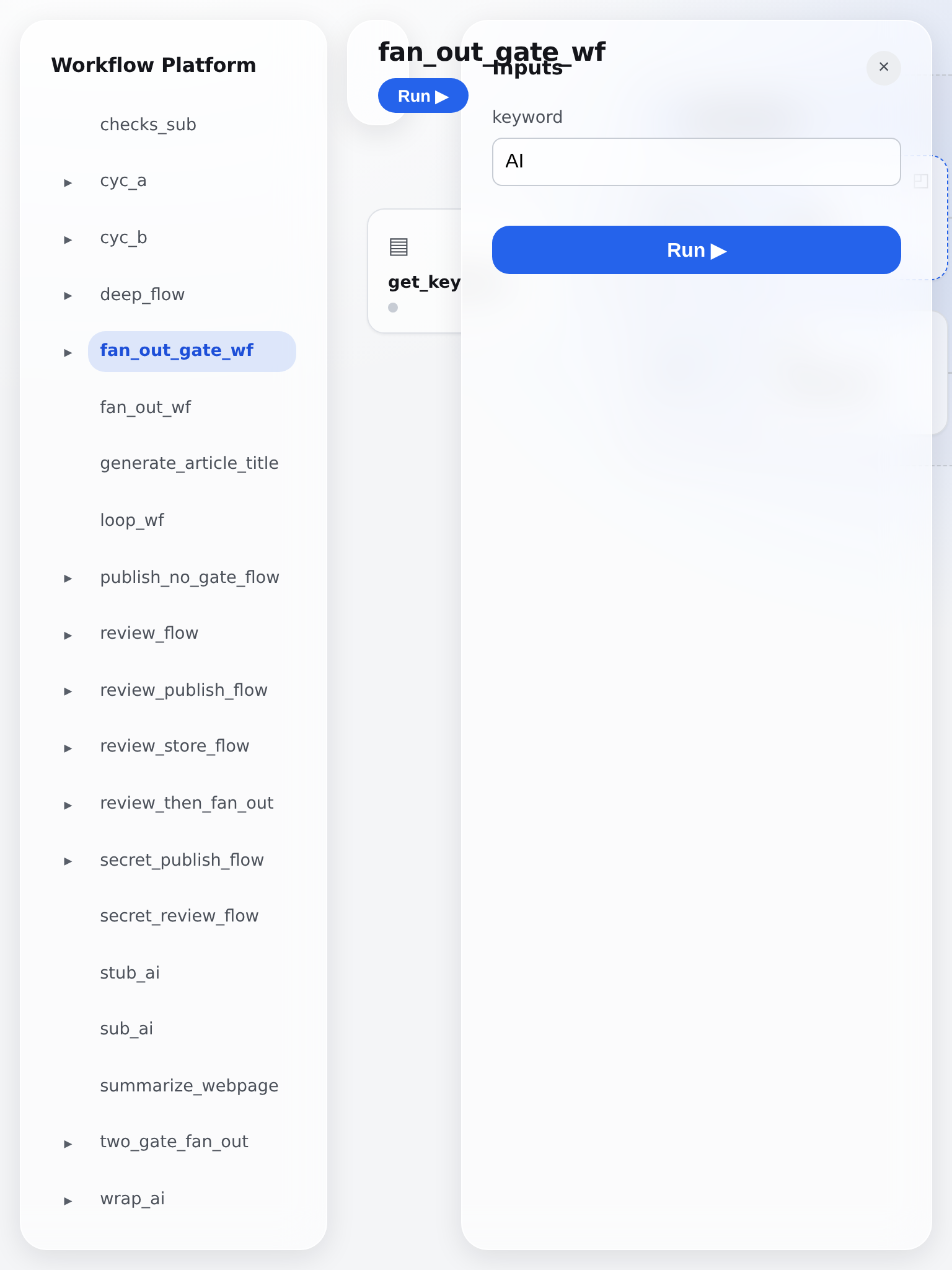
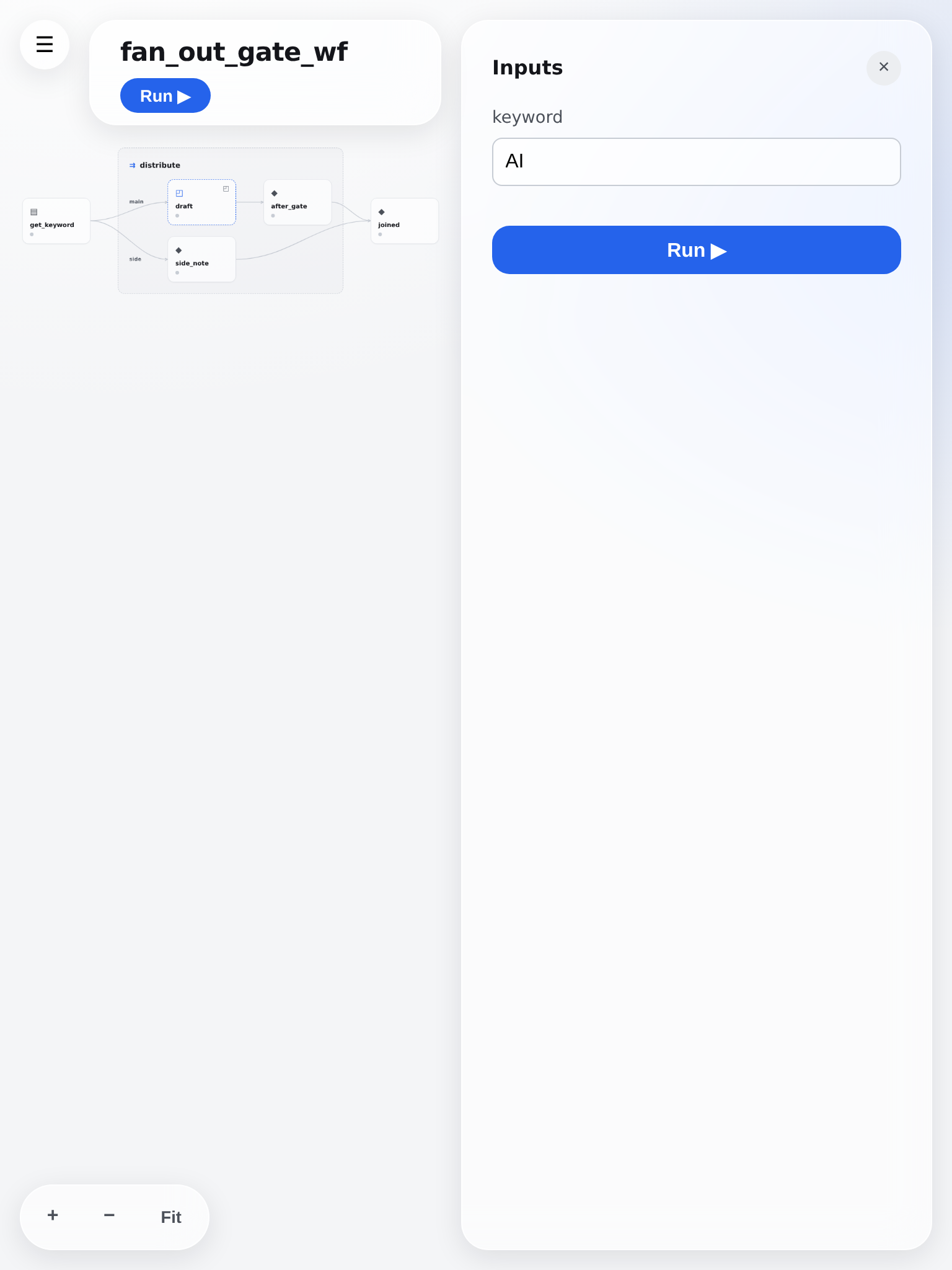
Tablet 768×1024 — The page with a run parked at a review gate
Tablet 768×1024 — The review gate open — approve or send back
What is new on the phone
- The step panel is a bottom sheet sized to its content, so the graph stays visible above it and you can still tap another step.
- Approve / Send back are pinned to the sheet's bottom edge — they were below the fold behind a scroll, on the one screen that must not need hunting.
- A zoom / fit cluster. The canvas has no scrollbars, so nothing on screen said it could be moved at all.
- Steps are reachable from a keyboard and a screen reader; they were list items with a click handler and nothing else.